You have a new hair salon – congratulations! However, how do you spread the word and get clients to come into your salon?
Marketing is the easy one-word answer here, but you want something more specific. You want a website where potential clients can see what your salon has to offer and also book appointments.
With that in mind, here are our tips on how you can build a fascinating (and functional) website for your new hair salon.
#1 Pick Colors That are Calming
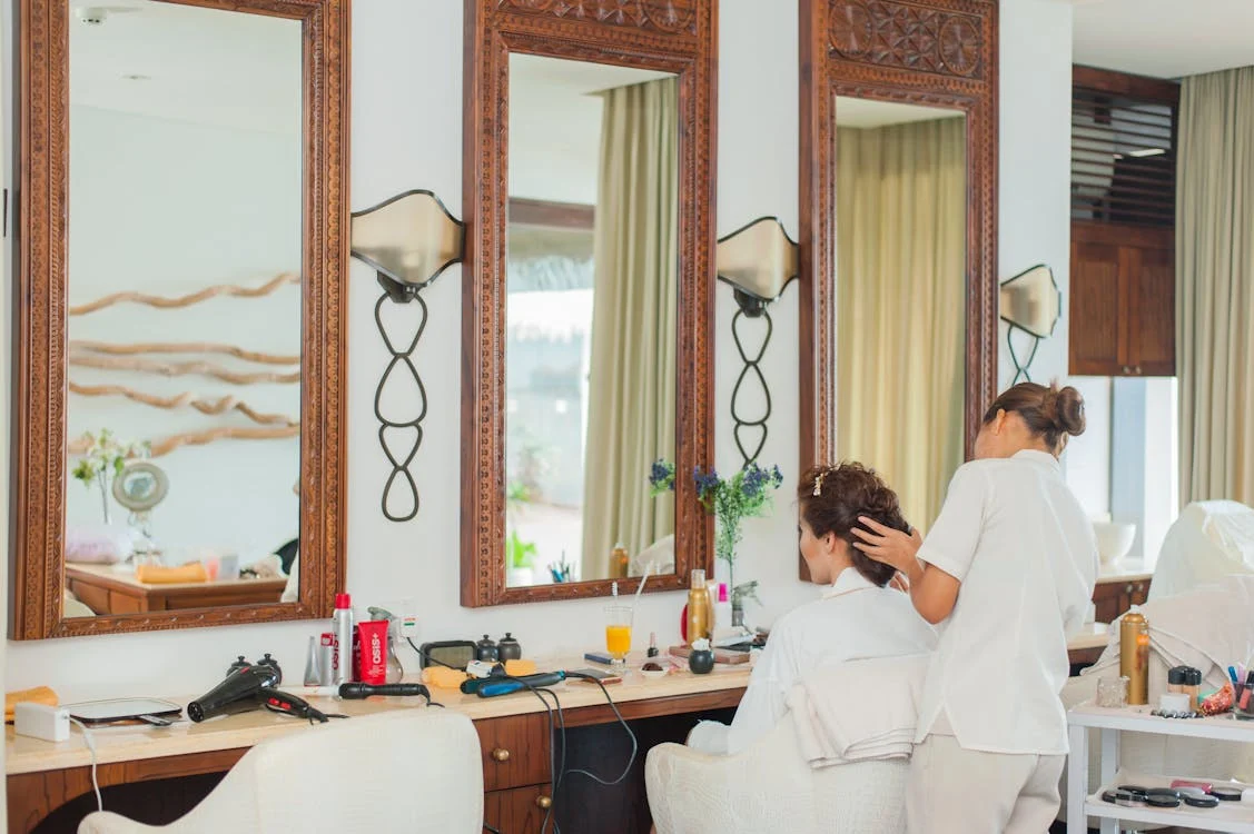
Every time you enter a hair salon, notice how calming the colors are. The interiors of these salons will always have shades of blue or green or neutral colors like beige or brown. That’s because these are some of the most calming colors for interior design.
Now, why calming colors? That’s because people running these salons want clients to feel as comfortable as possible.
We’ve all heard our friends or acquaintances feeling nervous or even scared at hair salons. This is mostly because these establishments tend to be posh and expensive. Hence, the calming colors on the walls and decors help calm them down to some extent.
Take a similar approach to your salon’s website – use a color palette that’s calming, ideally matching your salon’s colors. Let people enter your hair salon website and feel at ease. Matching the colors with your actual salon or its logo also does the work of branding.
#2 Note Down Your Vision If You’re Using an AI Website Builder
According to Hocoos, an AI website creator can take prompts or input from you and build you a fully functioning website within minutes. An AI website generated in such a manner will basically bring your vision and ideas to life. For that, however, AI website builders will ask you a few questions, which is why you need to prepare yourself accordingly.
When using an AI website generator, the website design process, as well as the overall web development, depends on you and your prompts. Hence, you should take detailed notes of what you want to see from your salon website, and how you want your visitors to feel.
Take note of the colors you want, the sections, headers, hero section design, layout, etc. Be very specific. For instance, if you want a specific font at a specific size on your intro or hero section, mention that as well. AI websites thrive on specificity; so don’t be vague or the results will be equally vague.
#3 Simplify the Client Appointment Process As Much As You Can
One thing you don’t want to do is make booking an appointment feel like a chore. Your hair salon website should offer a seamless way for clients to book their slots without hassle.
Consider using a simple online booking system with a clean, intuitive interface. Make sure the “Book Now” button is easy to find, preferably on the homepage, and the entire process only takes a few clicks.
Give visitors the option to select services, stylists, and times with ease, and confirm the appointment via email or SMS. When the process is simple, it reflects positively on your business, making clients feel confident and comfortable before even stepping foot in your salon.
#4 Opt for More Pictures Over Illustrations
People want to see what they’re getting, especially when it comes to something as personal as their hair. That’s why using real, high-quality photos of your salon and your stylists’ work can be far more impactful than illustrations.
Pictures create trust, showing potential clients what they can expect when they visit. You can also include images of the salon itself to give visitors a feel for the environment. Whether it’s close-ups of haircuts, color transformations, or even shots of your clean, stylish salon interiors, photos help clients visualize the experience they’ll have.
Avoid overly stylized or generic stock images; they can make your website feel impersonal. Also, you don’t want to make potential clients feel like you’re cheaping out on a normal photoshoot.
#5 Don’t Overwhelm Your Visitors with Content
Less is more when it comes to content on your salon’s website.
It might feel tempting to fill every page with detailed descriptions of your salon’s services or features. However, keep in mind that your potential hair salon clients are likely skimming to find what they need. If the website feels cluttered, they might lose interest quickly.
Instead, focus on crafting concise, impactful messaging that clearly communicates what you offer. Use simple headlines and short paragraphs, and make the most of white space to ensure your site looks clean and professional.
Visitors should be able to easily navigate between pages, find important information quickly, and book an appointment without getting bogged down in unnecessary details. This point also proves the case for making the appointment process super easy.
Once all these details have been ensured, your hair salon website will be ready to launch. Give it some time and watch it bring in more attention and customers to your salon.


Leave a Reply
View Comments